Every vehicle on the road you can hear outside, the rechargeable battery in your headphones, and the phone or computer you’re reading this article on right now — they all came from the minerals extracted, processed, transported and sold somewhere — likely from points all over the planet.
We live at the centre of a spiderweb of global mining supply chains. But it’s a tricky business to measure the cumulative impact of these supply chains, which can span multiple continents and involve dozens of entities, formal and informal.
A new study published in the journal Communications Earth & Environment may have just given a big boost to anyone looking for a clear picture of what those supply chains look like at their point of origin.
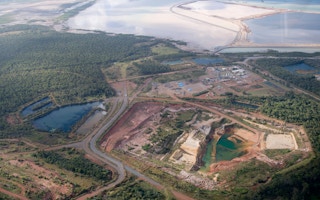
Using high-resolution satellite data, researchers meticulously pored over images from across the globe, isolating and marking the boundaries of a combined 65,585 square kilometres (25,323 square miles) of mining sites. The data set, which includes large-scale mining operations as well as informal artisanal sites, is one of the most detailed ever created. And to make sure that others can build off their work, the study’s authors have made it available to the public for free.
“What I hope is that people will use it to understand the consequences of supply chains and the footprint of mining in context,” said Tim Werner, a fellow at the University of Melbourne in Australia and one of the study’s lead authors. “There’s a million different things that you can overlay against these mining areas.”
Werner and his colleagues built on previous studies that used similar imagery to map the locations of mining sites worldwide. But their study includes far more detail on those sites than before, delineating the boundaries of specific mining features like waste dumps, tailings dams and processing infrastructure. By including a finer analysis of mining-related land use, Werner said he hopes the data set will help train image-recognition tools in how to automatically spot and analyse mining sites from satellite imagery in the future.
“
What I hope is that people will use it to understand the consequences of supply chains and the footprint of mining in context. There’s a million different things that you can overlay against these mining areas.
Tim Werner, researcher, University of Melbourne
For researchers, journalists or analysts looking to determine the ecological and social impacts of mines in specific regions, the level of spatial detail included in the study could be a breakthrough.
“We actually get a more accurate representation of the perimeter of mines,” Werner said. “So you could imagine that if a pile of waste is a source of pollution, you can use [the data set] to more accurately model the direction that pollutants are coming from, because you’ve got an image that shows little speckles of where the wastes are rather than an overall kind of blob.”
Of the 74,548 “mine area polygons” included in the study, 79 per cent were concentrated in just 13 countries: China, the US, Russia, Australia, Indonesia, South Africa, Ukraine, Ghana, Canada, India, Brazil, Kazakhstan and Chile. Just over a third of the polygons corresponded to larger mines that averaged slightly more than 30 km2 (12 mi2) per polygon, such as the Salar de Atacama salt flat lithium mines in Chile, the single largest site. In contrast, nearly 55 per cent of the polygons captured in the study represented much smaller mining sites, at less than 0.15 km2 (0.06 mi2).
Artisanal mining sites only constituted about 2 per cent of the mapped polygons, although the researchers only analysed areas that are known to have significant informal mining activities, and they say their figures are likely an underestimate of the sector’s size.
“We’re sort of playing catch-up with artisanal and small-scale mining,” Werner said. “So we’ve tried to increase our representation of those kind of areas in this data set. And basically what we’re learning is that although [they] contribute a relatively small portion to global supply, their footprint is still quite large.”
The top mineral commodity by number of mining polygons captured in the study was coal, followed by gold, copper, iron, phosphate and salt.
In one standout finding, nearly 10 per cent of the total mining polygons fell inside of protected areas such as national parks, Ramsar wetlands and UNESCO World Heritage Sites. While previous studies have confirmed the widespread occurrence of mining inside protected areas across the world, the data set includes more detail on those activities than ever before. Overall, a staggering 6,232 km2 (2,406 mi2) of boundary-violating mining operations were mapped by the study.
Werner said that finding is just one example of the data set’s potential public interest value.
“We chose protected areas as one interesting thing, but you could look at the distribution of different bird species, or things like flooding risk, for example. Or how a different mine is going to be impacted by climate change in the future, or sea level rise and extreme heat. How are they situated in relation to human settlements and Indigenous populations? There are so many important questions we can address,” he told Mongabay.
This story was published with permission from Mongabay.com.