One of the biggest problems with global warming has been the failure of science to communicate to ordinary people that it is actually happening, let alone what can be done about it.
To continue reading, subscribe to Eco‑Business.
There's something for everyone. We offer a range of subscription plans.
- Access our stories and receive our Insights Weekly newsletter with the free EB Member plan.
- Unlock unlimited access to our content and archive with EB Circle.
- Publish your content with EB Premium.
But a professor from the United Kingdom has come up with a way to show global warming in a single, powerful image.
“Climate Stripes” is a colour coded visualisation of our warming planet from the year 1901 to 2018. Data on the website Show Your Stripes enables people to see how their own countries have warmed over the last century or so. They can download the image, which has been printed by fans of the site on garments from t-shirts and dresses to ties and hoodies.
The colour blue represents cooler years and red warmer years, on a chart that shows how dramatically the world has heated up over time, with warming having accelerated in recent years in line with rising greenhouse gas emissions.
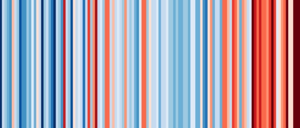
Here is the how the world has warmed over the last century or so.

The world’s warming history, from 1901 to 2018. Temperature relative to the average for the whole period. Image: #ShowYourStripes
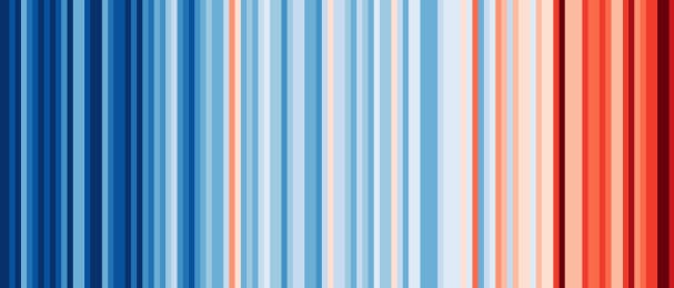
Here’s how the United States, the world’s largest economy, has warmed since 1901.
How the United States has warmed from 1901 to 2018. Image: #ShowYourStripes
And here’s the warming story for China, the world’s largest carbon emitter.

How China has warmed from 1901 to 2018. Image: #ShowYourStripes
And here’s India’s 117-year warming history.

How India has warmed from 1901 to 2018. Image: #ShowYourStripes
And Singapore’s history of warming.
How Singapore has warmed from 1901 to 2018. Image: #ShowYourStripes
The ‘Show Your Stripes’ project is the work of Prof Ed Hawkins from Reading University, who came up with the idea after playing with data from the world’s major meteorological agencies collated by Berkeley Earth, an American non-profit set up to address the concerns of global warming skeptics.
Prof Hawkins told BBC News: “What I’ve learnt from this is that you don’t need the numbers to get the message across. The colours will do that.”