
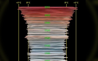

A climate scientist has designed a new way of visualising data to show how global temperatures have changed over time.
To continue watching, subscribe to Eco‑Business.
Access all our exclusive content and archive — with a 7-day free trial. Then just US$5/month. Cancel anytime.
- Exclusive access to training across business and policy topics
- Direct access to industry leaders at Eco-Business events
- A seat among the decision makers shaping the region's sustainable development
‘Climate spiral’ shows monthly global temperature change between 1880 — around the time of the industrial revolution — and 2021.
The visualisation emerges in the same week that analysis from the International Energy Agency found that the amount of heat-trapping carbon dioxide in the atmosphere reached an all-time high in 2021.
It is based on data from the Goddard Institute of Space Studies, a NASA laboratory in Greenbelt, Maryland, and designed by Ed Hawkins from the University of Reading’s National Centre for Atmospheric Science.
Hawkins was also behind the Climate stripes project, which in 2019 used data from major meteorological agencies collated by Berkeley Earth to show global warming over the past century in a single colour-code image.