
It was the first year in which average global temperatures at the surface exceeded 1.5°C above pre-industrial levels in at least one global temperature dataset.
Here, Carbon Brief examines the latest data across the oceans, atmosphere, cryosphere and surface temperature of the planet.
Noteworthy findings from this 2023 review include:
- Global surface temperatures: It was the warmest year on record by a large margin – at between 1.34°C and 1.54°C above pre-industrial levels across different temperature datasets.
- Exceptional monthly temperatures: Global temperatures set a new record each month between June and December. September smashed the prior record for the month by a “gobsmacking” 0.5°C.
- Warmest over land: It was the first year the global average land temperature was more than 2°C above pre-industrial levels.
- Warmest over oceans: It was the first year that global average ocean surface temperatures exceeded 1C compared with pre-industrial levels.
- Ocean heat content: It was the warmest year on record for ocean heat content, which increased notably between 2022 and 2023.
- Regional warming: It was the warmest year on record in 77 countries – including China, Brazil, Austria, Bangladesh, Germany, Greece, Ireland, Japan, Mexico, the Netherlands, South Korea and Ukraine – and in areas where 2.3 billion people live.
- Unusual warmth: 2023 was much warmer than scientists estimated it would be at the start of the year and there remain open questions about what precise factors have driven the exceptional warmth. Even El Niño – the usual suspect behind record warm years – does not clearly explain 2023 temperatures.
- Comparison with climate models: Observations for 2023 are above the central estimate of climate model projections in the Intergovernmental Panel on Climate Change (IPCC) sixth assessment report, but well within the model range.
- Warming of the atmosphere: It was the warmest year in the lower troposphere – the lowest part of the atmosphere. The stratosphere – in the upper atmosphere – is cooling, due in part to heat trapped in the lower atmosphere by greenhouse gases.
- Sea level rise: Sea levels reached new record-highs, with notable acceleration over the past three decades.
- Shrinking glaciers and ice sheets: Cumulative ice loss from the world’s glaciers and from the Greenland ice sheet reached a new record high in 2023, contributing to sea level rise.
- Greenhouse gases: Concentrations reached record levels for CO2, methane and nitrous oxide.
- Sea ice extent: Arctic sea ice saw its sixth-lowest minimum extent on record, while Antarctic sea ice saw a new record low extent for almost the entire year, much of it by an exceptionally large margin.
- Looking ahead to 2024: Carbon Brief predicts that global average surface temperatures in 2024 are most likely to be slightly warmer than 2023 and set a new all-time record. However, large uncertainties remain given how exceptionally and unexpectedly warm 2023 was.
Warmest year on record for the Earth’s surface
Global surface temperatures were exceptionally hot in 2023, exceeding the prior record set in 2016 by between 0.14°C and 0.17°C across different surface temperature datasets. It was unambiguously the warmest year since records began in the mid-1800s.
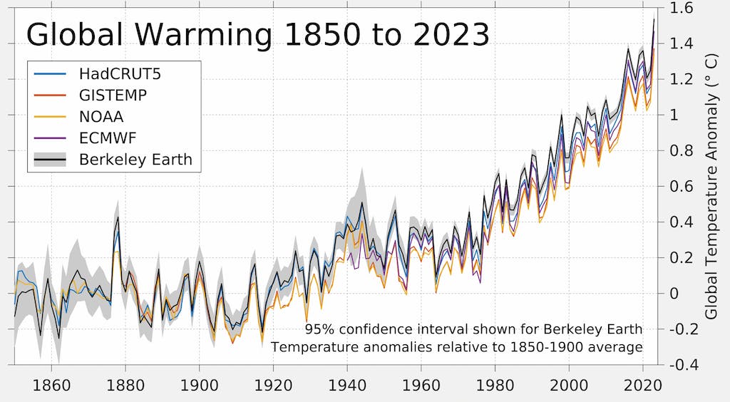
The figure below shows global surface temperature records from five different datasets: NASA; NOAA; the Met Office Hadley Centre/University of East Anglia’s (UEA) HadCRUT5; Berkeley Earth; and Copernicus ERA5.
Other surface temperature datasets not shown, including JRA-55, the AIRS satellite data and the Japanese Meteorological Agency, also show 2023 as the warmest year on record.
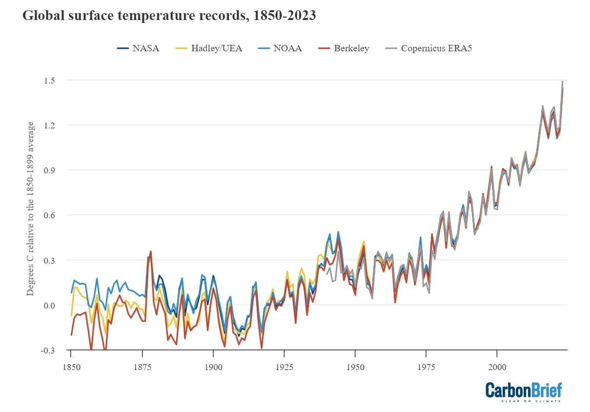
Annual global average surface temperatures over 1850-2023. Data from NASA GISTEMP, NOAA GlobalTemp, Hadley/UEA HadCRUT5, Berkeley Earth and Copernicus ERA5. Temperature records are aligned over the 1981-2010 period and use the average of NOAA, Berkeley and Hadley records to calculate warming relative to the pre-industrial baseline. Chart by Carbon Brief.
Global surface temperature records can be calculated back to 1850, though some groups such as NASA GISTEMP choose to start their records in 1880 when more data was available.
Prior to 1850, records exist for some specific regions, but are not sufficiently widespread to calculate global temperatures with high accuracy (though work is ongoing to identify and digitise additional records to extend these further back in time).
These longer surface temperature records are created by combining ship- and buoy-based measurements of ocean sea surface temperatures with temperature readings of the surface air temperature from weather stations on land. (Copernicus ERA5 and JRA-55 are an exception, as they use weather model-based reanalysis to combine lots of different data sources over time.)
Some differences between temperature records are apparent early in the record, particularly prior to 1900 when observations are more sparse and results are more sensitive to how different groups fill in the gaps between observations. However, there is excellent agreement between the different temperature records for the period since 1970, as shown in the figure below.
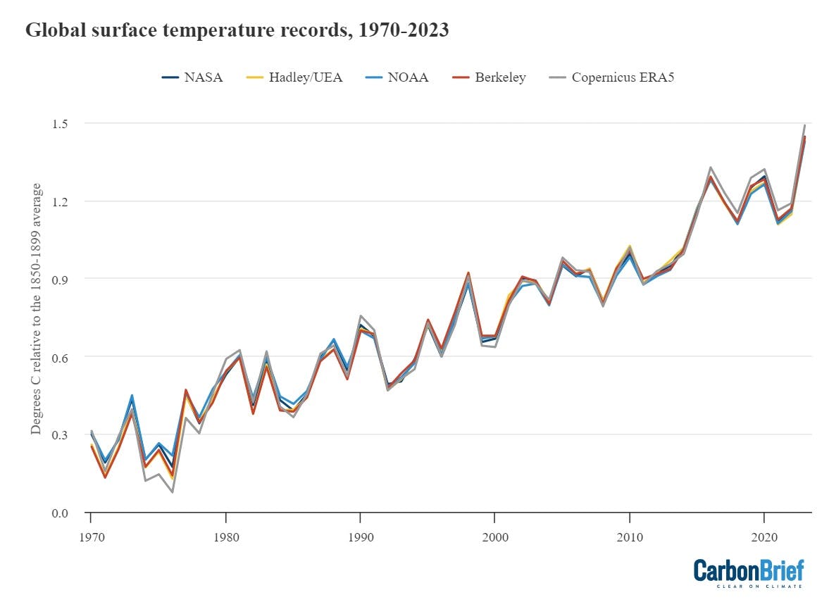
Annual global average surface temperatures as in the prior chart, but showing the period from 1970-2023. Chart by Carbon Brief.
Global temperatures in 2023 clearly stand out as much warmer than anything that has come before. This can be seen in the figure below from Berkeley Earth. Each shaded curve represents the annual average temperature for that year. The further that curve is to the right, the warmer it was.
The width of each year’s curve reflects the uncertainty in the annual temperature values (caused by factors such as changes in measurement techniques and the fact that some parts of the world have fewer measurement locations than others).
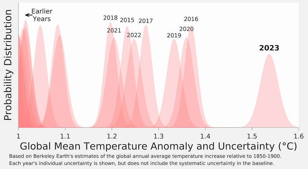
Global average surface temperatures for each year, relative pre-industrial, with their respective uncertainties (width of the curves) from the Berkeley Earth surface temperature record. Note that warming is shown here relative to the temperature to the 1850-1900 period. Figure from Berkeley Earth.
The year 2023 was the warmest on record for both the world’s land and ocean regions.
It was also the first year where global average land temperatures exceeded 2°C and the first year in which global ocean temperatures exceeded 1°C relative to pre-industrial levels.
The figure below shows land (red) and ocean (blue) temperatures along with their respective confidence intervals, relative to pre-industrial levels, in the Berkeley Earth surface temperature record.
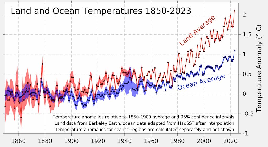
Land and ocean temperature rise since the pre-industrial 1850-1900 period. Figure from Berkeley Earth.
Global land regions – where the global human population lives – has been warming around 70 per cent faster than the oceans – and 40 per cent faster than the global average in the years since 1970.
While 2023 as a whole has been exceptionally warm, it started off a bit cooler, with the first few months of the year failing to set any new records. However, from June onward each month was warmer than the same month in any prior year since records began. September was particularly “gobsmacking”, shattering the prior September record by a full 0.5°C.
The figure below shows each month of 2023 in black, compared to all prior years since 1850. Each year is coloured based on the decade in which it occurred, with the clear warming over time visible as well as the exceptional margin by which 2023 exceeded past years between July and December.
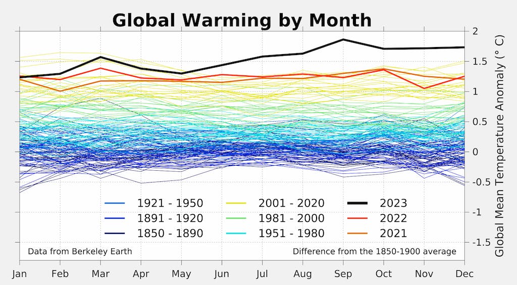
Monthly global surface temperatures for each year since 1850, with anomalies shown relative to the pre-industrial 1850-1900 period. Figure from Berkeley Earth.
Pushing up against the 1.5°C target
In the 2015 Paris Agreement, the world agreed to work to limit global temperatures to well-below 2°C and to pursue efforts to “limit the temperature increase to 1.5°C above pre-industrial levels”.
While the exceedance of these climate targets was not specifically defined in the agreement, it has since been widely interpreted (for example, by the IPCC) as a 20-year average period.
Crucially, the limits refer to long-term warming, rather than an individual year that includes the short-term influence of natural fluctuations in the climate, such as El Niño.
However, a single year exceeding 1.5°C still represents a grim milestone, a sign that the world is quickly approaching the target. And, in the Berkeley Earth dataset, 2023 was the first year above 1.5°C.
It came in a hair’s width below 1.5°C in the Copernicus and Hadley datasets, at 1.48°C and 1.46°C, respectively, and was lower on NOAA and NASA datasets as shown in the table below.
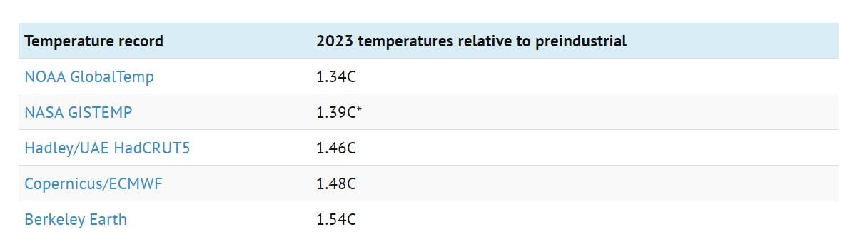
Global temperature anomalies for 2023 relative to preindustrial temperatures (1850-1899). *Note that GISTEMP uses a 1880-1899 baseline as it does not cover the 1850-1879 period.
As noted earlier, these datasets are nearly identical over the past 50 years. Differences in warming relative to pre-industrial levels emerge earlier in the record, particularly prior to 1900 when observations are more sparse and the choice of how to fill in the gaps between observations has a large impact on the resulting temperature estimate.
The figure below shows how different temperature records look if each is calculated relative to its own pre-industrial baseline, rather than using an average pre-industrial baseline as shown in the prior section. Focusing on warming since pre-industrial – rather than more recent warming – magnifies differences between groups, with the variation in warming across groups largely due to the most uncertain early part of the record.
Annual global surface temperatures since 1850, with anomalies shown relative to the pre-industrial 1850-1900 period for each dataset. Figure from Berkeley Earth.
Highest ocean heat content on record
Last year was the warmest on record for the heat content of the world’s oceans. Ocean heat content (OHC) has increased by around 473 zettajoules – a billion trillion joules – since the 1940s. The heat increase in 2023 alone compared to 2021 – about 15 zettajoules – is around 25 times as much as the total energy produced by all human activities on Earth in 2021 (the latest year in which global primary energy statistics are available).
Human-emitted greenhouse gases trap extra heat in the atmosphere. While some of this warms the Earth’s surface, the vast majority – around of 93 per cent – goes into the oceans. About two-thirds of this accumulates in the top 700 metres, but some also ends up in the deep oceans.
The figure below shows annual OHC estimates between 1950 and present for both the upper 700 metres (light blue shading) and 700-2,000 metres (dark blue) of the ocean.
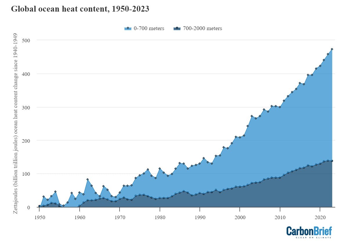
Annual global ocean heat content (in zettajoules - billion trillion joules, or 10^21 joules) for the 0-700 metre and 700-2,000 metre layers. Data from Cheng et al. (2024). Chart by Carbon Brief.
In many ways, OHC represents a much better measure of climate change than global average surface temperatures. It is where most of the extra heat ends up and is much less variable on a year-to-year basis than surface temperatures. It shows a distinct acceleration after 1991, matching the increased rate of greenhouse gas emissions and other radiative forcing elements over the past few decades.
This year saw a substantial update to the OHC dataset provided by the Institute for Atmospheric Physics (IAP) that Carbon Brief features in its State of the Climate reports. The transition from version 3 to version 4 introduced a new quality control system to detect and remove spurious measurements across different instrument types.
As the figure below highlights, this results in a notable increase in OHC over the past decade (red lines and shading) relative to the prior version of the dataset (black lines).
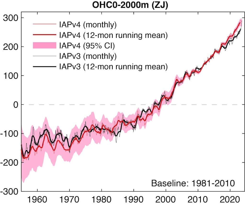
Monthly global ocean heat content (in zettajoules - billion trillion joules, or 10^21 joules) for the 0-2,000 metres for version 3 and version 4 of the IAP dataset. Figure from Cheng et al. (2024).
A year of climate extremes
While media coverage of 2023 temperatures has largely focused on the global average, there have been many different regions of the planet experiencing climate extremes.
The figure below shows global temperature anomalies in 2023 across the world, with red areas warmer than the baseline period (1951-80) used by Berkeley Earth and blue areas experiencing cooler temperatures.
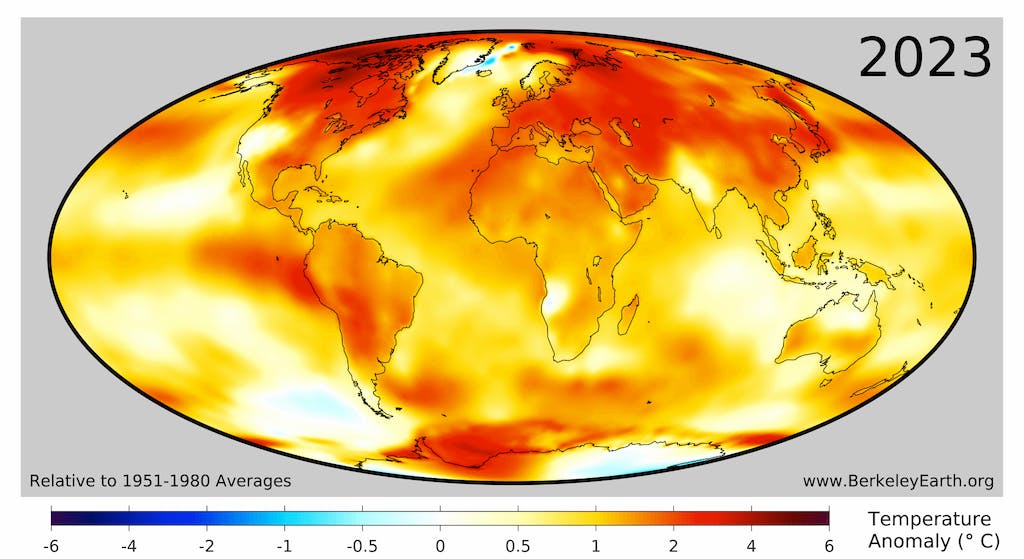
Surface temperature anomalies for 2023 from Berkeley Earth. Note that Berkeley uses a 1951-80 baseline to calculate anomalies.
In 2023, 77 countries saw their warmest year on record, including: Afghanistan, Albania, Antigua and Barbuda, Argentina, Austria, Azerbaijan, Bangladesh, Bhutan, Bolivia, Bosnia and Herzegovina, Brazil, Bulgaria, Cape Verde, Cameroon, China, Comoros, Costa Rica, Croatia, Cuba, Czechia, Dominica, Dominican Republic, Ecuador, El Salvador, Federated States of Micronesia, Gambia, Germany, Greece, Grenada, Guatemala, Guinea, Guyana, Haiti, Honduras, Hungary, Ireland, Ivory Coast, Jamaica, Japan, Kazakhstan, Kiribati, Kosovo, Kyrgyzstan, Liechtenstein, Macedonia, Mexico, Moldova, Montenegro, Morocco, Myanmar, Netherlands, Nicaragua, Nigeria, North Korea, Oman, Panama, Paraguay, Peru, Republic of the Congo, Romania, Saint Kitts and Nevis, Saint Lucia, Saint Vincent and the Grenadines, San Marino, Senegal, Serbia, Slovakia, Slovenia, South Korea, Tajikistan, The Bahamas, Trinidad and Tobago, Turkmenistan, Ukraine, Uzbekistan, Venezuela and Yemen.
Approximately 2.3 billion people, or around 29 per cent of Earth’s population, live in places that observed their locally warmest year during 2023.
The figure below highlights regions of the planet that experienced their top-five warmest (red shading) or coldest (blue) temperatures on record in 2023. Overall, around 17 per cent of the planet set a new record, including 23 per cent of the land and 14 per cent of the ocean. No location on the planet experienced record cold temperatures (or even top-5 record cold temperatures) for the year as a whole.
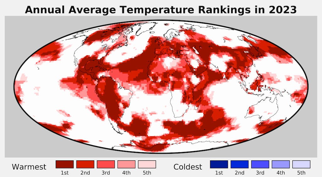
Regions of the world among the five warmest (reds) of five coolest (blues) on record for average annual temperatures in 2023. Figure from Berkeley Earth.
Explaining 2023’s unusual heat
Scientists did not expect 2023 to be all that exceptional at the start of the year. As Carbon Brief reported at the start of 2023, four different groups provided temperature predictions for the year prior to any data being collected – the UK Met Office, NASA’s Dr Gavin Schmidt, Berkeley Earth and Carbon Brief’s own estimate.
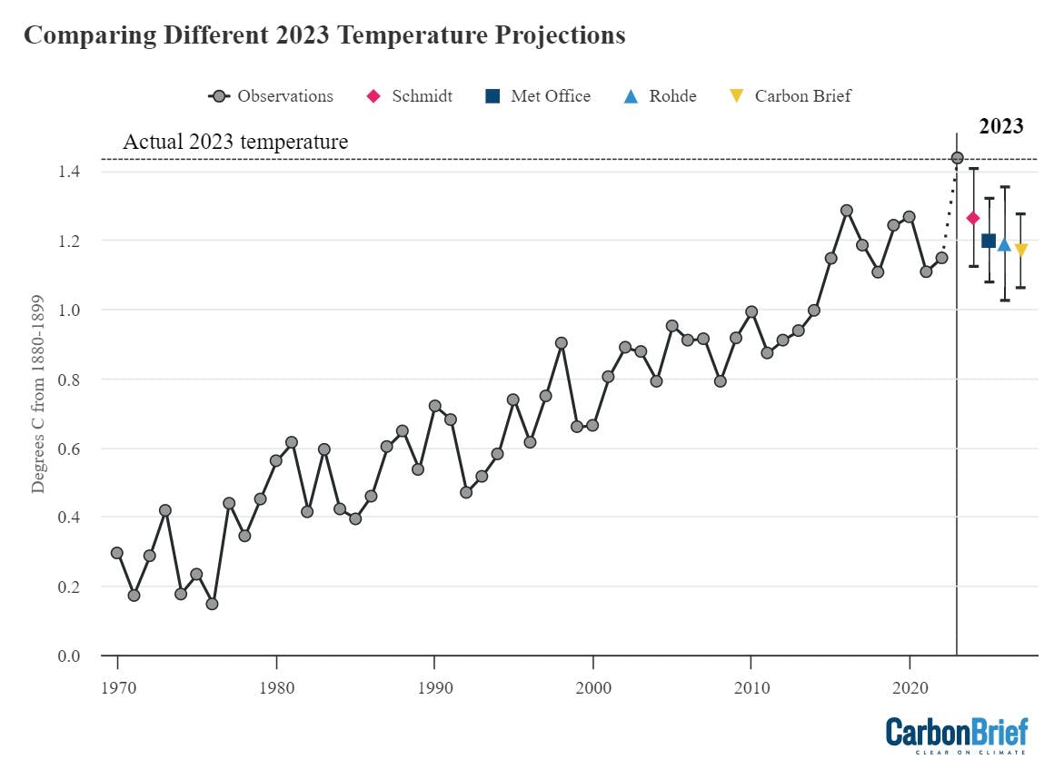
Temperature predictions for 2023 from the UK Met Office, NASA’s Dr Gavin Schmidt, Berkeley Earth and Carbon Brief relative to pre-industrial (1880-99) temperatures. Chart by Carbon Brief.
As Carbon Brief noted in January 2023:
“La Niña conditions are expected to persist for at least the first three months of 2023. Because there is a lag of a few months between when El Niño or La Niña conditions peak in the tropical Pacific and their impact on global temperatures, these La Niña conditions will likely have a lingering cooling influence on 2023 temperatures.”
Carbon Brief estimated that 2023 was “very likely to be between the third and ninth warmest year on record, with a best estimate of being the fifth warmest on record – similar to 2022”, and suggest that if an El Niño develops in latter half of 2023 it would make it likely that 2024 will set a new record.
This estimate, alongside all the other groups predicting 2023 temperatures, was wrong. Not only did 2023 turn out to be the warmest year on record, but it fell well outside the confidence intervals of any of the estimates. And while there are a number of factors that researchers have proposed to explain 2023’s exceptional warmth, scientists still lack a clear explanation for why global temperatures were so unexpectedly high.
Over the longer-term, human emissions of CO2 and other greenhouse gases alongside planet-cooling aerosols are the main driver of global temperatures. Global temperatures have risen by approximately 1.3°C since pre-industrial times as a result of human activity. However, on top of long-term warming, global temperatures vary year to year by up to 0.2°C.
These variations are primarily driven by El Niño and La Niña events that redistribute heat between the atmosphere and oceans. However, other factors such as volcanic eruptions, the 11-year solar cycle and changes in short-lived climate forcers can influence year-to-year temperature changes.
The figure below, created by Dr Robert Rohde at Berkeley Earth, explores some of the main drivers of temperature change over the past decade.
These include continued accumulation of greenhouse gases, the evolution of El Niña and La Niña, and the 11-year solar cycle. It also includes two new factors that emerged during the decade: the 2022 eruption of the Hunga Tonga volcano and the 2020 phase-out of sulphur in marine fuels. Both of these are estimated to have relatively modest effects at present – less than 0.05C each – but with large scientific uncertainties.
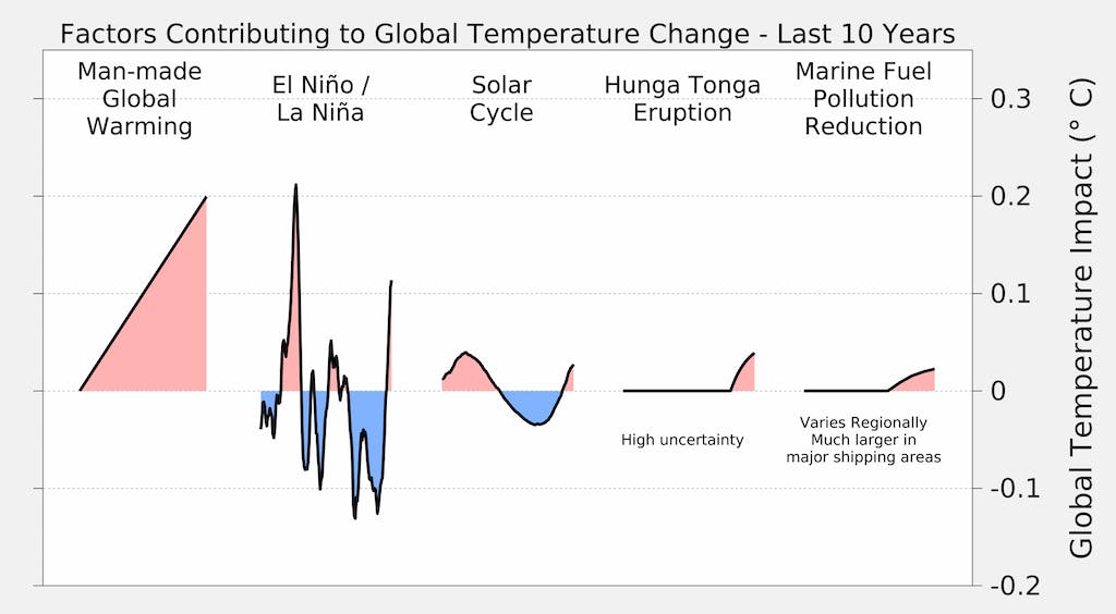
Illustration of contributing factors driving global surface temperatures over the past decade. Figure from Berkeley Earth.
However, both the Tonga eruption and the phase-out of sulphur in marine fuel are problematic explanations of extreme temperatures in 2023.
There is still a vigorous debate in the scientific literature about whether the eruption cooled or warmed the planet based on estimates of both sulphur dioxide and water vapour in the atmosphere, with some papers arguing for warming and others for cooling. Some modelling suggests that the largest impacts of the eruption would be in winter months, which does not match the timing of extreme summer temperatures experienced in 2023.
Similarly, the phase-out of sulphur in marine fuels occurred in 2020. If it had a large climate impact, it would show up in 2021 and 2022 rather than suddenly affecting the record in 2023. While it definitely has had a climate impact – alongside the broader reduction in aerosol emissions over the past three decades – the timing suggests that its likely not the primary driver of 2023 extremes.
Even El Niño – the usual suspect behind record warm years – does not clearly explain 2023 temperatures. Historically global temperatures have lagged around three months behind El Niño conditions in the tropical Pacific; for example, El Niño developed quite similarly in 1997, 2015 and 2023. But it was the following year – 1998 and 2016 – that saw record high temperatures.
The figure below shows the El Niño (red shading) and La Niña (blue) conditions over the past 40 years (collectively referred to as the El Niño-Southern Oscillation, or “ENSO”). While not unprecedented, the extended La Niña conditions since the latter part of 2020 have extended for an unusually long period of time.
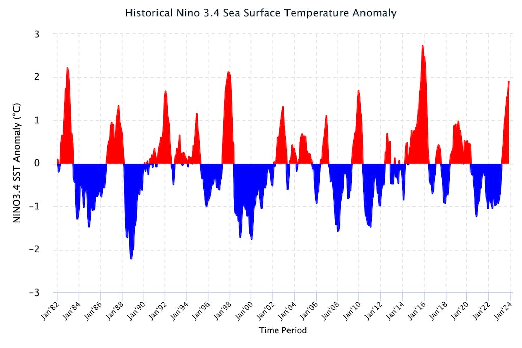
Niño3.4 sea surface temperature anomalies relative to the ocean average, for 1982-2023. Deviations below 0.5C and above 0.5C are generally used to determine La Niña and El Niño conditions, respectively. Figure from International Research Institute (IRI) at Columbia University.
Carbon Brief has used this historical relationship between ENSO conditions and temperature to effectively remove the effects of El Niño and La Niña events from global temperatures, as shown in the figure below.
However, this approach – which has worked well for prior years – indicates that there would be almost no effect of El Niño on temperatures in 2023. This is because the lingering global temperature impact of La Niña conditions on the first half of the year would approximately cancel out the influence of El Niño on the second half. This model would suggest that the current El Niño event would primarily affect 2024 temperatures, analogous to what occurred in 1998 and 2016.
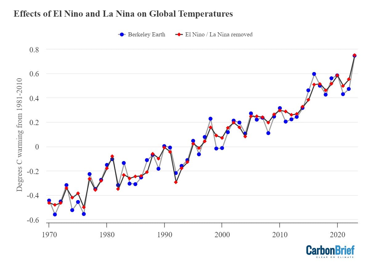
Annual global average surface temperatures from Berkeley Earth, as well as Carbon Brief’s estimate of global temperatures with the effect of El Niño and La Niña (ENSO) events removed using the Foster and Rahmstorf (2011) approach. Figures are shown relative to a 1981-2010 baseline. Chart by Carbon Brief.
It is possible that this El Niño event is behaving differently and that the rapid switch from a rare and extended triple-dip La Niña event from late 2020 to the start of this year into strong El Niño conditions is resulting in a more rapid global temperature response.
But this remains speculative at this point and researchers are just starting to disentangle the causes of the unexpected extreme global heat the world experienced in 2023.
Observations broadly in-line with climate model projections
Climate models provide physics-based estimates of future warming given different assumptions about future emissions, greenhouse gas concentrations and other climate-influencing factors.
Here, Carbon Brief examines a collection of climate models – known as CMIP6 – used in the 2021 science report of the IPCC’s sixth assessment. In CMIP6, model estimates of temperatures prior to 2015 are a “hindcast” using known past climate influences, while temperatures projected after 2015 are a “forecast” based on an estimate of how things might change.
Using the CMIP6 ensemble is a bit more challenging than past generations of models because a subset of models have unrealistically high climate sensitivity and poorly reproduce historical observations. Rather than simply average all the models – as had been done in prior assessments – the IPCC used an approach that effectively weights models by their performance. This means the models align better with the range of climate sensitivity derived from multiple different lines of evidence.
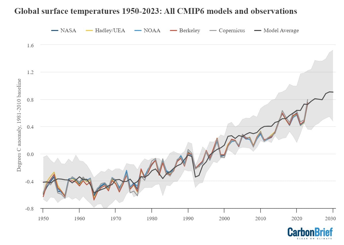
The figure below shows the range of individual CMIP6 model projections since 1950, as well as future projections through to 2100 under the middle-of-the-road SSP2-4.5 emissions scenario.
The black line shows the average of 22 different models whose transient climate response (TCR) falls within the IPCC’s “likely” range (which results in temperature projections nearly identical to the IPCC assessed warming). The grey area shows the 95 per cent (two standard deviation) range of the TCR-screened model projections. Observational temperatures are plotted on top of the climate model data, with individual observational records represented by coloured lines.
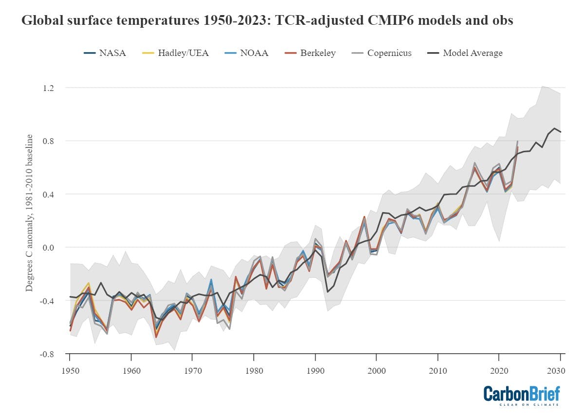
Annual global average surface temperatures from CMIP6 models and observations between 1950 and 2030 (through to 2023 for observations). Models use the SSP2-4.5 scenario after 2015. They are screened to only include those models with a transient climate response (TCR) in-line with the IPCC’s “likely” range as discussed in Hausfather et al (2022). Anomalies plotted with respect to a 1981-2010 baseline. Chart by Carbon Brief.
Using the TCR-screened subset, the findings show that 2023 temperatures are above the model average, but still well within the range of climate model projections. While some individual months have approached the upper end of the model range, the year as a whole is less anomalous.
The figure below shows the observed warming since pre-industrial (1850-99) in the five different observational datasets compared with climate model projections. The box plot below shows the 25th to 75th percentile of models and observations with a solid box, while the whiskers show 1.5 times the interquartile range.
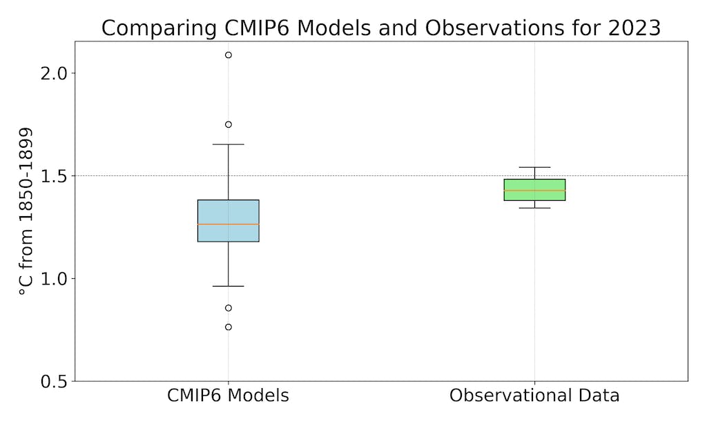
2023 temperatures for both TCR-screened CMIP6 models and observations compared to pre-industrial. Models use the SSP2-4.5 scenario after 2015. Chart by Carbon Brief.
Temperatures in 2023, relative to pre-industrial, were in the upper quartile (>75th percentile) of climate models assessed. However, this is not unexpected, as models do not have internal variability such as El Niño or La Niña events that occur at the same time as they do in the real world. (Scientists would expect observations to be on the high end of the model range during El Niño years and on the low end in La Niña years even if climate models were perfectly accurate.)
Finally, the figure below shows how observations compare to the full ensemble of 37 CMIP6 models, with no screening for transient climate response. Here, observations are generally below the model average over the past two decades and are roughly equal to the model average in 2023.
Annual global average surface temperatures from CMIP6 models and observations between 1950 and 2030 (through 2023 for observations). Models use the SSP2-4.5 scenario after 2015. Anomalies plotted with respect to a 1981-2010 baseline. Chart by Carbon Brief.
Record atmospheric temperatures
In addition to surface measurements over the world’s land and oceans, satellite microwave sounding units have been providing estimates of temperatures at various layers of the atmosphere since 1979.
The lowest layer they estimate – the lower troposphere – reflects temperatures a few kilometres above the surface and shows a pattern of warming similar – though not identical – to surface temperature changes. The records produced by Remote Sensing Systems (RSS) and the University of Alabama, Huntsville (UAH) both show 2023 as the warmest year on record in the lower troposphere. The chart below shows the two records – RSS in red and UAH in blue – for the lower troposphere (TLT).
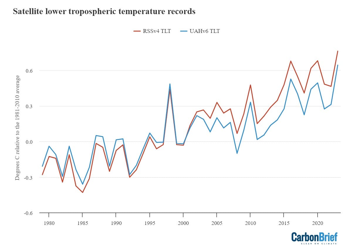
Global average lower-troposphere temperatures from RSS version 4 (red) and UAH version 6 (blue) for the period from 1979-2023, relative to a 1981-2010 baseline. Chart by Carbon Brief.
The lower troposphere tends to be influenced more strongly by El Niño and La Niña events than the surface. Therefore, satellite records show correspondingly larger warming or cooling spikes during these events. This is why, for example, 1998 shows up as one of the warmest years in satellites, but not in surface records.
The two lower-tropospheric temperature records show large differences after the early 2000s. RSS shows an overall rate of warming quite similar to surface temperature records, while UAH shows considerably slower warming in recent years than has been observed on the surface. Both have seen large adjustments in recent years that have warmed RSS and cooled UAH compared to prior versions of each record.
Overall, there is more agreement with RSS to other records that include satellite data (such as reanalysis products ERA5 and JRA-55, as well as the shorter AIRS satellite-based surface temperature record), while the UAH record is a bit of an outlier compared to the others.
In addition to a temperature record of the lower troposphere, RSS and UAH also provide measurements of the lower stratosphere – a region of the upper atmosphere around 18km above the surface. The figure below shows lower stratospheric temperature (TLS) records for both RSS (red) and UAH (blue) from 1979 through 2023.
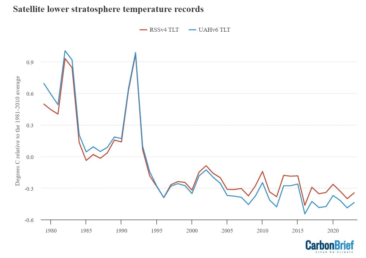
Global average lower stratospheric temperatures from RSS version 4 (red) and UAH version 6 (blue) for the period from 1979-2023, relative to a 1981-2010 baseline. Chart by Carbon Brief.
The stratosphere has been cooling for the past few decades in a clear fingerprint of human greenhouse gases, which warm the lower part of the atmosphere by trapping heat while cooling the upper atmosphere as less heat escapes. If other factors – such as changing solar output – were causing climate change, both the stratosphere and troposphere would be warming.
Greenhouse gas concentrations reach new highs
Greenhouse gas concentrations reached a new high in 2023, driven by human emissions from fossil fuels, land use and agriculture.
Three greenhouse gases – CO2, methane (CH4) and nitrous oxide (N2O) – are responsible for the bulk of additional heat trapped by human activities. CO2 is by far the largest factor, accounting for roughly 42 per cent of the increase in global surface temperatures since the pre-industrial era (1850-1900).
Methane accounts for 28 per cent, while nitrous oxide accounts for around 5 per cent. The remaining 25 per cent comes from other factors including carbon monoxide, black carbon and halocarbons, such as CFCs.
Human emissions of greenhouse gases have increased atmospheric concentrations of CO2, methane and nitrous oxide to their highest levels in at least a few million years – if not longer.
The figure below shows concentrations of these greenhouse gases – in parts per million (ppm) for CO2 (blue line) and parts per billion (ppb) for methane (orange) and nitrous oxide (red) – from the early 1980s through to October 2023 for CO2 and September 2023 for CH4 and N2O (the most recent data currently available).
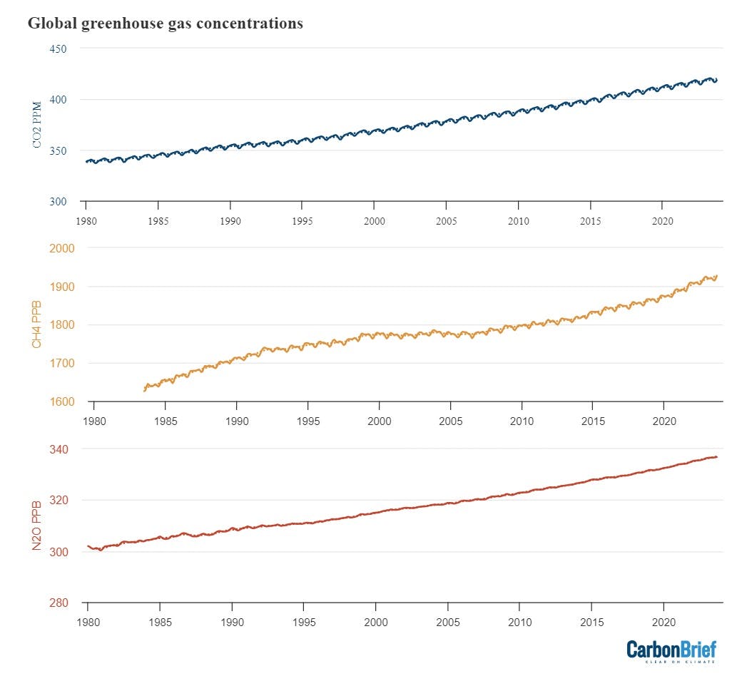
Global concentrations of CO2, methane (CH4) and nitrous oxide (N2O). Based on data from NOAA’s Earth Systems Research Laboratory. Note that the y-axes do not start at zero. Chart by Carbon Brief.
Methane concentrations, in particular, have seen a sharp rise over the past decade after a plateau in the 2000s. This appears to be driven by both increased emissions from agriculture and fossil fuels, in roughly equal measure. Thawing Arctic permafrost and other sources of methane in high-latitude regions are growing, but emissions above a latitude of 60 degrees north are only around 4 per cent of the total global methane emissions.
Accelerating sea level rise
Modern-day sea levels have risen to a new high, due to a combination of melting land ice (such as glaciers and ice sheets), the thermal expansion of water as it warms and changes in land water storage.
In recent years, there have been larger contributions to sea level rise from melting ice sheets and glaciers, as warmer temperatures accelerate ice sheet losses in Greenland and Antarctica.
Since the early 1990s, the increase in global sea level has been estimated using altimeter data from satellites. Earlier global sea levels have been reconstructed from a network of global tide gauge measurements. This allows researchers to estimate how sea level has changed since the late 1800s.
The chart below shows five different modern sea level rise datasets (coloured lines), along with satellite altimeter measurements from NASA satellites as assessed by the University of Colorado (in black) after 1993. (As sea level rise data has not yet been released for the whole year, the 2023 value is estimated based on data through October.)
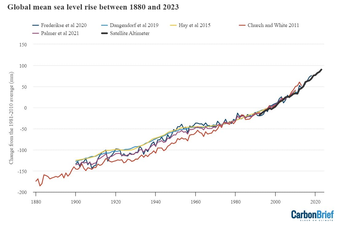
Global average sea level rise reconstructed from tide gauge data between 1880 and 2023 from Frederikse et al 2020, Dangendorf et al 2019, Hay et al 2015, Church and White 2011, and Palmer et al 2021. Satellite altimeter data from 1993 (black) to present is taken from the University of Colorado. Chart by Carbon Brief.
Sea levels have risen by over 0.2 metres (200mm) since 1900. While sea level rise estimates mostly agree in recent decades, larger divergences are evident before 1980. There is also evidence of accelerating sea level rise over the post-1993 period when high-quality satellite altimetry data is available. (See Carbon Brief’s explainer on how climate change is accelerating sea level rise.)
Shrinking glaciers and ice sheets
A portion of this sea level rise is being driven by melting glaciers on land. Scientists measure the mass of glaciers around the world using a variety of remote-sensing techniques, as well as through GRACE measurements of the Earth’s gravitational field. The balance between snow falling on a glacier and ice loss through melting and the breaking off – or “calving” – of icebergs determines if glaciers grow or shrink over time.
The World Glacier Monitoring Service is an international consortium that tracks 164 different glaciers in 19 different regions around the world. The figure below shows the change in global average glacier mass from 1950 through to the end of 2022 (2023 values are not yet available). Note that glacier melt is reported in metres of water equivalent, which is a measure of how much mass has been lost on average.
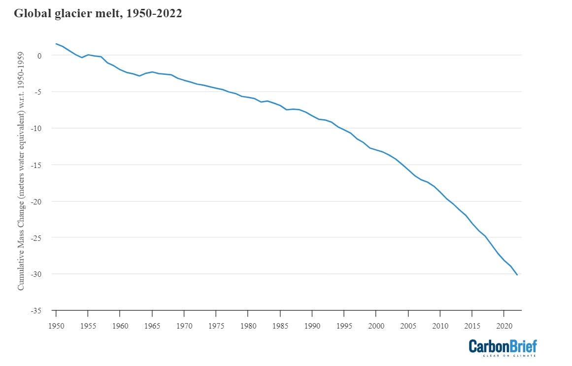
Global average glacier melt over the 1950-2022 period from the World Glacier Monitoring Service, in metres of water equivalent. Carbon Brief.
Greenland ice sheets have become a larger contributor to sea level rise in recent years due to accelerating loss of mass. The year 2023 was the 27th in a row where Greenland lost ice overall, with 196Gt of ice lost over the 12 months from September 2022 to August 2023. Greenland last saw an annual net gain of ice in 1996.
The figure below shows the cumulative mass balance change – that is, the net ice loss – from Greenland between 1970 and October 2021. The different coloured lines indicate estimates from different studies. The authors find that Greenland has lost over 6tn metric tonnes of ice over the past 50 years – more than 700 tonnes lost per person for every person on the planet.
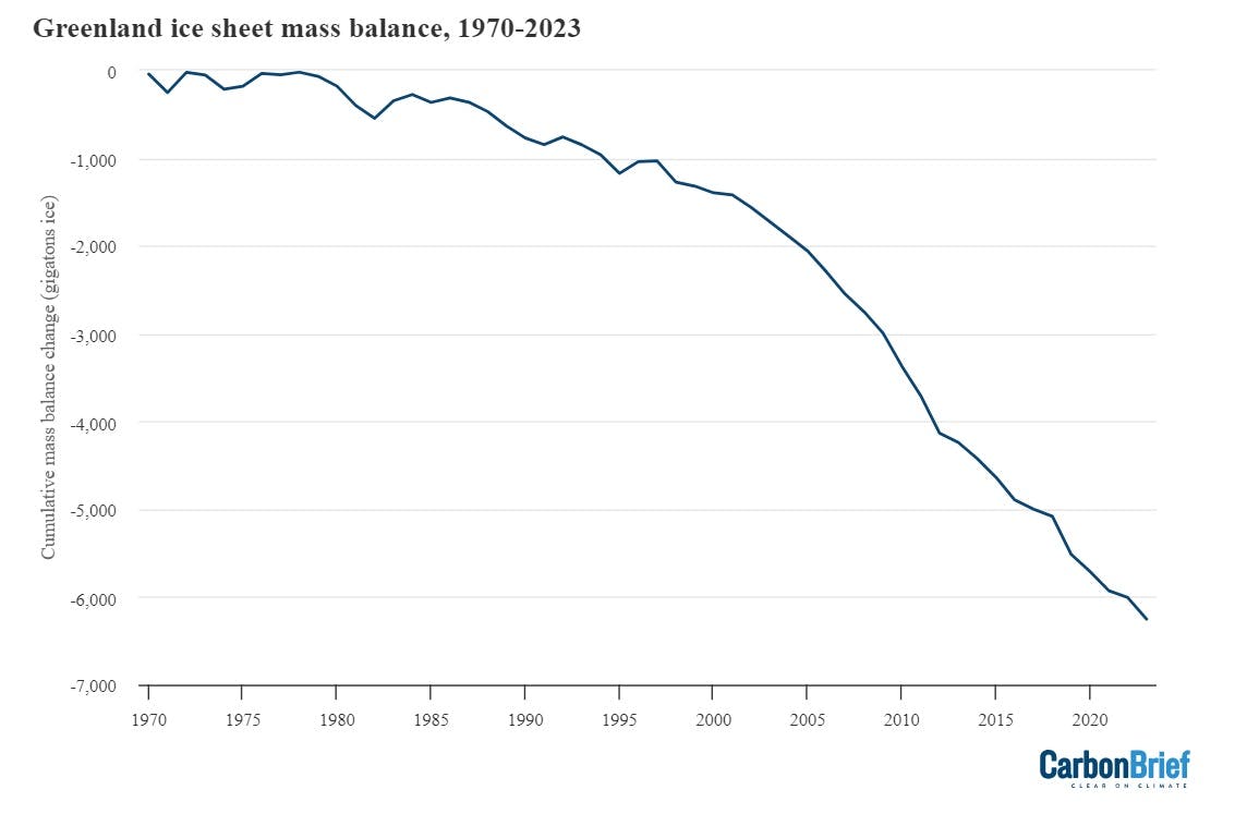
Cumulative ice loss from Greenland in billion metric tonnes (gigatonnes) between 1970 and 2023 from Mankoff et al 2021, updated through December 2023. Chart by Carbon Brief.
Record-low Antarctic sea ice levels
Arctic sea ice was at the low end of the historical (1979-2010) range for most of 2023, but did not set any new all-time low records apart from a few individual days in February and March. The summer minimum extent – the lowest recorded level for the year – was the sixth-lowest since records began in the late 1970s.
Antarctic sea ice, on the other hand, saw new record low levels for virtually the entire year – except for periods in April, November and December of the year.
Antarctic sea ice was particularly low between June and November, shattering prior records by a substantial margin. While long-term trends in Antarctic sea ice have been ambiguous in the past (unlike in the Arctic where there is a consistent long-term decline), there is increasing evidence that human-driven warming is starting to drive significant loss of sea ice in the region.
The figure below shows both Arctic (red line) and Antarctic (blue line) sea ice extent for each day of the year, along with how it compares to the historical range (corresponding shading).
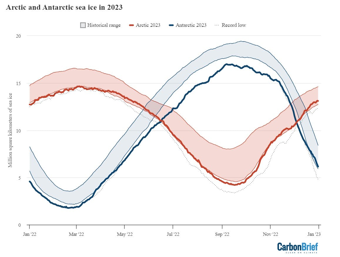
Arctic and Antarctic daily sea ice extent from the US National Snow and Ice Data Center. The bold lines show daily 2023 values, the shaded area indicates the two standard deviation range in historical values between 1979 and 2010. The dotted black lines show the record lows for each pole. Chart by Carbon Brief.
Looking ahead to 2024
The unusual global temperatures experienced in 2023 makes it more challenging to predict what 2024 might have in store.
If history is any guide here, the year after the development of an El Niño event tends to be considerably warmer than the year in which it develops. For example, strong El Niño events developed over the latter half of both 1997 and 2015 and peaked early the following year, and 1998 and 2016 both set new records by a large margin.
However, 2023 was so exceptionally warm that it suggests that this El Niño might be behaving differently, with global surface temperatures responding more rapidly than in the past. If this is the case, 2024 would not necessarily follow the pattern of past El Niño events and is less likely to be substantially warmer than 2023.
There have been four published predictions – from the UK Met Office, NASA’s Dr Gavin Schmidt, Berkeley Earth and Carbon Brief (in this article) – of what temperatures might look like in 2024.
The figure below shows the four different 2024 predictions compared to the average of six different temperature records (NASA, NOAA, Hadley, Berkeley, Copernicus, and the Japanese JRA-55 reanalysis) used by the World Meteorological Organization (WMO). These have been “normalised” to show 2024 warming relative to 2023 in the WMO dataset. This is to remove any differences in predictions due to divergences in the baselines used by different temperature records.
Carbon Brief’s prediction of likely 2024 temperatures is based on a statistical model using the year, the average temperature of the past year, and projections of El Niño/La Niña conditions over the first three months to predict the temperatures of the year.
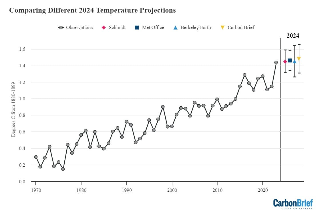
Temperature projections for 2024 from the UK Met Office, NASA’s Dr Gavin Schmidt, Berkeley Earth, and Carbon Brief, relative to pre-industrial (1880-99) temperatures and compared to the historical average of six different datasets produced by the WMO. Chart by Carbon Brief.
The Met Office, Dr Schmidt, Berkeley Earth and Carbon Brief estimates all have 2024 as more likely than not to be warmer than 2023 – but only by a small margin. In all estimates it is close to a coin flip which will end up as the warmer year.
Against a 1880-99 pre-industrial baseline, the central estimate of all four forecasts is just below 1.5°C of warming, with ranges suggesting that temperatures could top 1.5°C next year.
However, the poor performance by all of these groups in accurately predicting 2023 temperatures mean these should be treated with some caution. Until scientists have a clearer understanding of the drivers of the unusual warmth the world experienced in 2023, it will not be possible to fully predict how temperatures will evolve in 2024 as the current El Niño event peaks and fades away.
Ultimately, what matters for the climate is not the leaderboard of individual years. Rather, it is the long-term upward trend in global temperatures driven by human emissions of greenhouse gases. Until the world reduces emissions down to net-zero, the planet will continue to warm.
As the chart below highlights, if the warming trend over the past 40 years continues, average surface temperatures are likely to pass 1.5°C in the early 2030s and 2°C by around 2060.
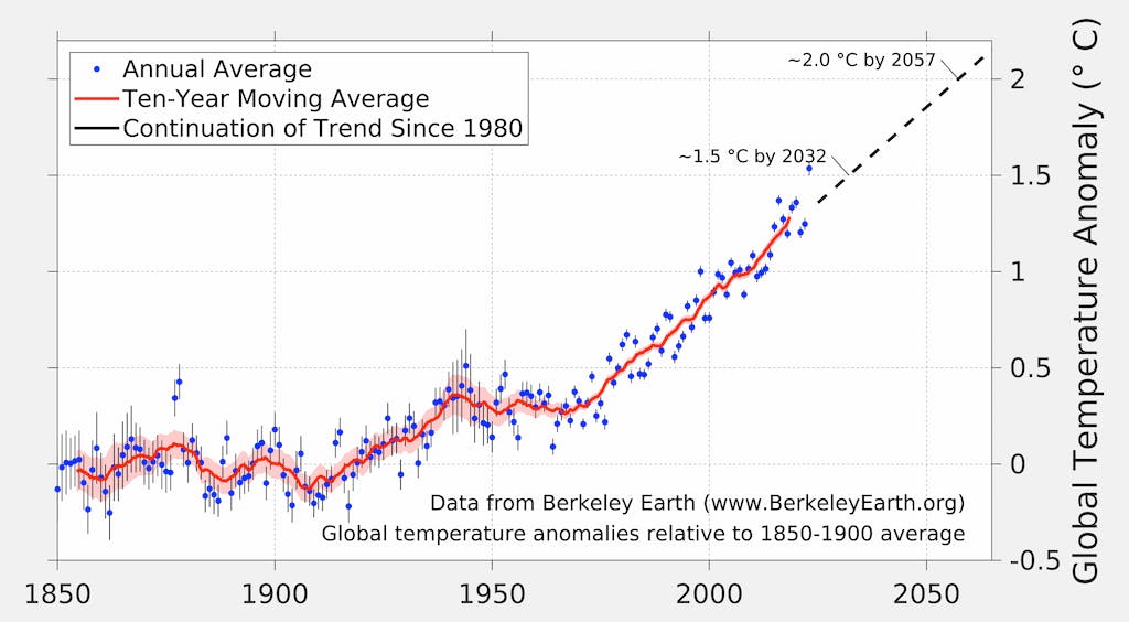
Expected exceedance years of 1.5°C and 2°C given a continuation of the long-term warming trend. Note that exceedance is defined as the long-term average temperature, rather than any individual year. Figure from Berkeley Earth.
This story was published with permission from Carbon Brief.