For people who find it hard to believe the Earth really is warming, new visual evidence will soon be available – two atlases, one showing graphically the retreat of Arctic ice, the other the human and economic price exacted by extreme weather.
The 10th edition of the National Geographic Atlas of the World is to be published on 30 September. The publication’s geographer, Juan José Valdés, says the reduction in multi-year ice – ice that has survived for two summers – is so noticeable compared with previous editions that it is the biggest visible change since the breakup of the USSR.
“You hear reports all the time in the media about this,” he said. “Until you have a hard-copy map in your hand, the message doesn’t really hit home.” He believes atlases “open people’s eyes to what’s happening in the world.”
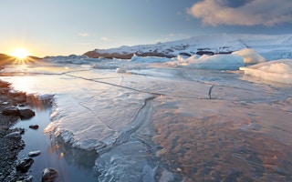
The Arctic sea ice has been retreating in the last 30 years or so by 12 per cent each decade, NASA says. (On land the change is even more marked. Spring and autumn on the Greenland icecap have warmed by more than 3°C, although summer temperatures have not changed)
According to NASA’s Operation IceBridge the sea ice is now as much as 50 per cent thinner than in previous decades, falling from an average thickness of 3.8 metres (12.5 feet) in 1980 to 1.9 m (6.2 ft) in recent years. May 2014 represented the third lowest extent of sea ice for that month in the satellite record, the US National Snow and Ice Data Center (NSIDC) says.
“
It’s not necessarily the number of extreme events that is increasing, but the increasing exposure and vulnerability that turns them into disasters, as well as better reporting of them than in the past
Jochen Luther of World Meteorological Organisation
Self-supporting
The ice loss is accelerated by what scientists call a positive feedback: the warming in effect fuels itself. Thin ice reflects light less effectively than thick ice, allowing more sunlight to be absorbed by the ocean, which further weakens the ice and warms the ocean even more.
The melting ice also triggers another feedback. Thinner ice is flatter and scientists say this allows melt ponds to accumulate on the surface, reducing the ice’s reflectiveness and absorbing more heat.
In National Geographic’s atlas the multi-year ice, which is older, is shown as a large white mass, with the maximum extent of sea ice – the pack ice that melts and refreezes each season – shown by a simple line. This edition shows the area of multi-year ice is strikingly smaller than previously.
Some scientists say the atlas should show the total ice area at the end of the Arctic summer, including the remaining ice newly formed in the previous winter. This total minimum cover is measured in September, while total maximum cover is measured in March, at the end of winter.
Omitting the minimum cover means ice one year old or less is not being shown, the critics say. But the mapmakers say they do not show the minimum extent because there is only so much information they can include without confusing users.
There is also criticism of the atlas’s reliance on a single year (the new edition uses 2012 data, an extremely low year for ice cover). The critics say this probably over-emphasises long-term trends. But if 2013, a year with more ice, is shown, the mapmakers counter, it could under-emphasise the trend towards rising temperatures.
Steep underestimate
The second publication, the Atlas of Mortality and Economic Losses from Weather, Climate and Water Extremes 1970-2012, is the work of the World Meteorological Organization (WMO) and the Centre for Research on the Epidemiology of Disasters (CRED) of the Catholic University of Louvain (UCL) in Belgium.
Disasters caused by such extremes, it says, are increasing globally, killing people and slowing economic and social development by years or decades. The period covered, the authors say, saw 8,835 disasters, 1.94 million deaths and US$2.4 trillion of economic losses resulting from droughts, extreme temperatures, floods, tropical cyclones and related health epidemics.
Preparations start in Geneva, Switzerland, on 14 July for the third World Conference on Disaster Risk Reduction, to be held in Japan in March 2015 by the United Nations.
Jochen Luther of WMO told the Climate News Network: “It’s not necessarily the number of extreme events that is increasing, but the increasing exposure and vulnerability that turns them into disasters, as well as better reporting of them than in the past.”
The UN’s Global Assessment Report on Disaster Risk Reduction 2013 said direct and indirect losses from natural hazards of all kinds had been underestimated by at least half because of problems with data collection.